


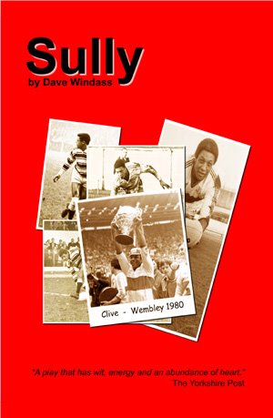
I'd like your help. Below are the proposed front and back covers for a print version of Sully. I'd really welcome feedback before the plunge is well and truly taken. These are scaled down versions, so don't panic re the resolution if you're in the print game. Also, on the back cover, there's a gap for an ISBN number and other bits and pieces, just in case you think it looks a bit weird. But, yeah, what do you think? If you click on them you'll be able to read the text!
Wednesday, September 06, 2006
Help...
![]()


7 comments:
The one with the photographs, by far.
I am liking the picture design, compardre. But does it have to be so red? Maybe a 20 per cent wash?
My own dream about the jacket last night (honestly) was like a pictoral interpretation of the Michael Jackson Black or White video. But can it be done?
Thanks Nick - have another look, it's front and back.
And thanks Eldred, good point. Well, apart from the Michael Jackson bit, it's far beyond what mere mortals can produce.
More comments welcomed!
Bugger me, I should slow down. A little bit embarassing - it is indeed the front and back...
I'd agree with the esteemed Eldred. The red is a bit 'in your face.'
Is red a good choice, as there's bound to be a fair few sad-sacks who'll say it's 'too HKR' biased? That said, i'm not sure that I have any better suggestions re a colour scheme.
Does the job for me, allthough I have to agree with it being a tad red.
I like the testimonial programme look about it but I did wonder, like NQ, if the colour scheme would favour one rugby side against the other.
Cheers guys, very useful. x
Will go back to the drawing board re the red and the Hull/Rovers balance. If anyone else pops by and sees it, please feel free to comment too.
Post a Comment